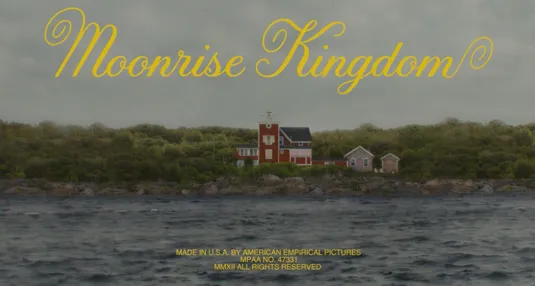
The title of a film is one of the first things the audience sees. This first impression is very important so it should quickly and efficiently convey the overall tone or theme of the film. Certain stylistic decisions may help reinforce a certain tone or attract the audience's attention. One aspect that can be changed to have varying reactions is the font of the title. The font of a title is similar to the accent of someone's speech. Font can be used to portray a unique tone and or feeling. In Moonlight Kingdom, a playful yellow font is displayed with a shot of a nice and calm house.
In the opening sequence of Catch Me if You Can, the title and credits are played with in a sense that the words blend with and interact with a dynamic background. This clever concept is visually appealing and keeps the audience visually engaged.
While the font and presentation of a title does not have to serve a specific purpose, it can be a useful tool that should be thought about. I plan on applying this thought and consideration in my own project.


No comments:
Post a Comment